Friends and colleagues,
This edition is a roundup of what we’ve been up to lately — with one deliberate omission.
Our Census of Governments work, which turned 56 years of state and local government finance data into something you can actually query, is getting its own edition of The Civic Pulse shortly. In the meantime, if you’d like a sneak peek, there’s the announcement and a case study on how it was built.
Beyond that, here’s what else we enjoyed this summer:
- Conducting budget reviews for grassroots groups in California and Texas
- Continuing to partner with the Student Leadership Network in New York City
- Using AI to compile data for the ACLU of Southern California
In all of these cases, we are reshaping how we work by incorporating LLMs, local and cloud, and learning where these tools are actively helpful and where they get in the way. It’s been a bumpy but educational journey so far!
As always, thank you for reading. On to the topics.
A summer of budget reviews
For local and state governments, summer is the season of budgets. That means one thing we did this summer was conduct city, county, and state budget reviews for grassroots groups. This year we’ve analyzed:
- Los Angeles County for Reimagine LA (opens in new tab)
- Orange County for Housing is a Human Right OC (opens in new tab)
- Huntington Beach for HB Citizens for Good Governance (opens in new tab)
- Smith and Harris Counties for the Texas Jail Project (opens in new tab)
- Tarrant County for the Justice Network of Tarrant County (opens in new tab)
- The California state budget for Californians United for a Responsible Budget, whose overview of the enacted 2026–27 corrections budget (opens in new tab) is out now
This year we used AI on several of these reviews. It made the most difference where the timeline was tight or the budget was small, which describes much of this list — several of these grassroots groups are run primarily or entirely by volunteers. LLMs have helped us work quickly and produce more tailored outputs aligned to the specific needs of each partner we work with.
Tarrant County is one example. We’ve worked with the Justice Network of Tarrant County once or twice in the past, so we had some familiarity with the county budget but not a lot. In this case, the analysis was constrained by both budget and timeline — the budget document came out on a Friday and the hearing was the following Thursday! In other words, the 300-page recommended budget landed six days before the only hearing dedicated to it. The group needed the analysis in an even shorter time if they were going to make sense of it and decide what feedback they wanted to share with County Commissioners!
As always, we started with the budget document, and the analysis turned up a process problem as much as a spending one. Tarrant is the only one of Texas’s five largest counties whose commissioners court meets just once a month. And under rules the court adopted in February, a speaker gets just three minutes to share their thoughts with commissioners — cut to two minutes if 30 people register, and one if 50 do. The better-attended the hearing, the less each person can say. For the sole hearing on the county budget, you can bet the group was expecting two minutes or less each.
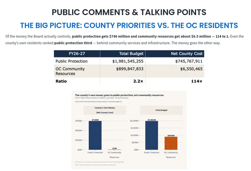
That is what led us to not only draft an analysis of the budget but a sample set of public comments, each making a different point. The group could then rework and share the comments amongst themselves to cover more topics. Instead of 10 versions of similar comments restating one or two overarching concerns with the budget, this approach allowed the extremely organized group to at least have the option to cover 10 different arguments, each in one to two minutes. Each draft comment aimed to land its main point in the first two sentences, so that if the clock ran out early the argument had already been made. Comments provided the starting points — people could, of course, add their own experiences, stories, and thoughts. This was a way to make it easier, on a very tight timeline, for a group of likeminded individuals to cover more of the topics they wanted to raise with the commissioners.
Our work with Orange County went much the same way, though there we have more history. We’ve been working with groups in Orange County for several years now, and the continued engagement pays off in both directions: we keep getting better at analyzing the budget and explaining what we find, and Housing is a Human Right OC keeps asking sharper questions. This year they published the result (opens in new tab) — a hearing packet and six comment scripts covering housing, homelessness services, mental health, immigrant legal defense, and county spending priorities. Check it out!
This summer, each memo where we used AI opened with a version of this note:
This memo was prepared with the assistance of Claude, an AI large language model, working under the direction of Civilytics Consulting. Unless otherwise noted, every figure comes from the [source budget document], and page numbers refer to the printed page numbers of that document. We believe the information is accurate but encourage readers to verify figures against the cited pages.
Naming the tool, citing every number to a page, and telling the reader to check us is the arrangement we have landed on for now — given tight timelines and budgets, and cases where we have not hand-verified each number. What do you think of that approach? We are curious to know what others are doing as well. If you are a consultant or researcher who discloses AI use in the work you hand to clients, we’d love to hear how you are framing it.
A continued partnership with the Student Leadership Network
Back in May we mentioned that we’d started building a curated literature review for the Student Leadership Network (SLN). What SLN wanted was research evidence on college access practices delivered as a knowledge base the team could query and extend, rather than a static document that would go stale.
We built it with AI assistance, but every study was hand-screened, tagged with a consistent set of categories (the strategy it tests, who it serves, how rigorous the evidence is, what kind of effect it found), and linked back to its full text where available. The current version holds over 250 studies, searchable by outcome (college enrollment, application completion), target population (students, high school advisors), intervention or strategy (financial aid application support, academic identity development), and more.
On top of the database sits a synthesis organized by topic — “data driven school counseling,” “application, financial aid, and transition support,” “bringing students to college campuses.” Each section opens with an Evidence-at-a-Glance summary, then walks through the mechanisms a strategy is assumed to work through and what the evidence means specifically for SLN.
SLN is now sharing the work with select partners to think about refinements and how it might reach further, including how other organizations and people working in the college access space could use or access it in the future.
In the meantime, we’ve started a second major project for the team. SLN has worked with over 40 schools in New York City across more than two decades — and SLN’s CIO, Jon Roure, has been there for more than 25 years of it, which is pretty incredible in this day and age. His institutional memory of these schools, their principals, and how both have changed is an asset we’ve been really impressed by.
That long history raises interesting questions about how college-going rates and destinations have shifted over time. We’re starting by comparing college-going outcomes across three groups of schools: those currently partnered with SLN, those that participated but later left the network, and those that never participated. We were excited by how easy NYC’s public dashboard makes it to do this in a fairly rigorous way!
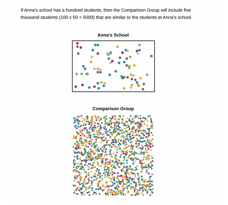
Most public dashboards let you compare a school to a district average, to another school you pick yourself, or maybe to a certain category of schools (e.g., “high poverty schools”). New York City does something much more ambitious. Its School Quality dashboard (opens in new tab) builds each school its own Comparison Group (opens in new tab): for every student in the school, the city finds the 50 most similar students citywide — matched exactly on grade, English language learner status, disability status, and economic need, then ranked on prior test scores — and pools them into what amounts to a synthetic comparison school. It has limits (no amount of matching on observable characteristics accounts for how families end up choosing schools in the first place), but building a defensible benchmark into the tool, instead of leaving every user to improvise one, is a real service.
Now that we’ve built a demo dashboard for SLN schools out of the public data, we’re looking forward to working with more detailed student-level records. We’ll be linking National Student Clearinghouse records on where SLN students enroll with College Scorecard data to ask whether SLN appears to shift students toward colleges that differ on net price, likelihood of graduation, and median earnings 10 years after entry.
When AI makes automation easier
The ACLU of Southern California contacted us earlier this spring about a report they’ve been working on related to what California counties actually spend on child welfare. Early on, we were going through lots of documents — the state budget, county budgets, reports, and so on — by hand. Side note: if you work or live in California, do you know how awesome the California Legislative Analyst’s Office (opens in new tab) is? They publish such useful analyses, and we relied on their report on child welfare in the 2025–26 budget (opens in new tab) to get an initial lay of the land.
Anyway, child welfare funding is very complicated. It comes from the federal government, the state, and counties’ own funds, and it arrives by formula, as reimbursement against costs already incurred, and through realignment streams that never show up as an allocation at all. This summer, we were considering piecing together one specific bit of information but weren’t sure if the amount of effort required was really worth it. Thanks to AI, it was an easier call.
Specifically, one piece of child welfare funding is captured in county fiscal letters (opens in new tab), the notices the state Department of Social Services sends counties to say what’s coming and what it’s for. There were 67 of these letters in FY25–26, all PDFs. Claude compiled them into a single table — every letter ruled in or out of scope for child welfare, every allocation extracted, each figure pulled twice (once by the model, once by an independent script reading the same PDF) with any disagreement halting the build, and anything ambiguous flagged rather than quietly resolved.
This is the oldest job in the book — read a stack of documents, pull out the numbers, build a table — and it’s one AI is genuinely good at. What it produces is simply one clearly documented layer, with its own boundaries written down: these are allocations, not reimbursements, and here is exactly which letters they came from. In a funding landscape this tangled, it was great to get one definitive, clearly scoped answer without too much human effort — and with a great deal of confidence in what it actually captured.
What’s next
Hannah is booking client engagements for the coming year. If you’re scoping a project — a one-off analysis, a longer embedded engagement, or extra capacity while someone is on leave — get in touch. Jared is building out our AI and LLM capabilities and looking for organizations to sponsor our continued work building the fiscal record of the state and local governments.
As always, thank you for reading, and please pass this along to someone who’d find it useful.
— Jared & Hannah